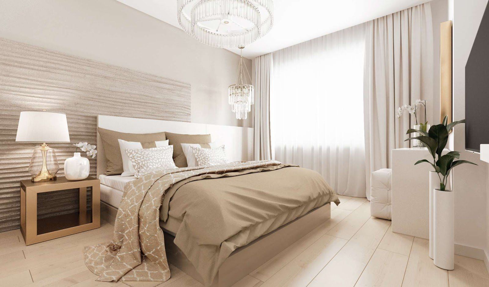
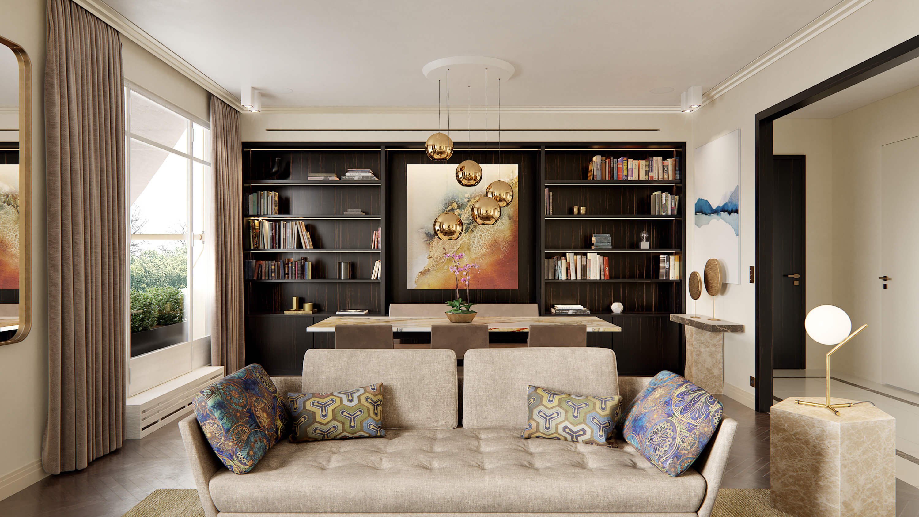
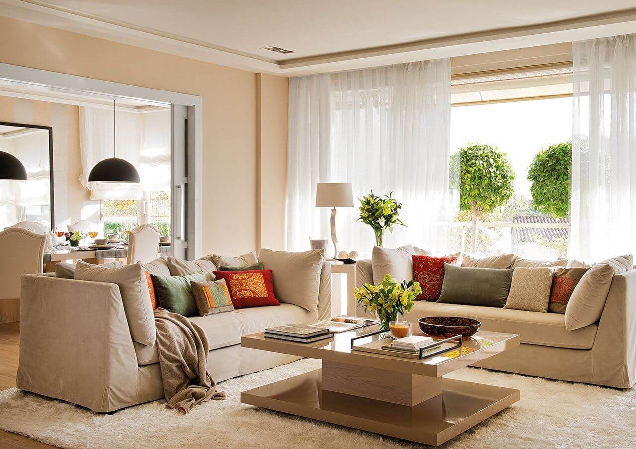
Beige and cream are among the most popular colors in interior design. It would seem nothing could be simpler to work with, yet beige turns out to be one of the hardest shades for a designer to get right.
Why People Love Beige
The answer is simple. A beige palette is light and does not overload a room with complex combinations, so furniture shapes and decor read clearly, and the eye picks up contrast and depth between elements. At the same time, designers often hear the complaint that beige interiors are boring and monotonous. Beige is a neat, visually stable color with no sharp edges: it reads as neutral, calm, elegant, and a little conservative. That is why many designers rank it alongside white and black as one of the core colors of interior design.
Form, Material, and Color
Every interior works through the interplay of form, material, and color. Because beige is so neutral, it puts the emphasis on form: a complex shape gets lost in a beige room, while simple, airy, minimal forms come forward. Balance is everything; a beige interior does not need pretentious forms to be interesting.
Each interior style has its own visual language of color, and beige appears in modern, classic, and Art Deco interiors alike. Light is decisive: beige does not forgive poor-quality materials, and it comes alive with soft, diffused light on natural materials such as stone, metal, and tinted glass. Zoning the space and grouping furniture clearly keeps a beige room from feeling flat.
Accents Without Excess
Remember the integrity of the whole. If floors and walls are plain, a few accents help, but never overdo them. Beige is the color of elegance; it loves muted shades and half-tones, and the mark of a skilled designer is a balance of accents with nothing missing and nothing extra.
The 65/25/10 Rule
Here is our rule of thumb for beige, a variation on the classic 60/30/10 rule: 65 percent beige on floors and walls, 25 percent for high-quality furniture and upholstery, and the remaining 10 percent for metal accents that bring a touch of Art Deco - luxurious and refined rather than flashy - and reflect the taste of the owner and the designer.
Choosing the Right Beige
Beige is not one color. Warm beiges lean toward yellow, pink, or orange; cool ones toward gray or green ("greige"). Always test paint samples on the actual wall, at different times of day, next to your flooring and fabrics. North-facing rooms need warmer beiges, while sun-filled rooms can take cooler ones without turning yellow.
Beige in Seattle Homes
Under the gray Pacific Northwest sky, cool beiges can look dull and gray themselves, so we usually choose warmer creams and sand tones, pair them with natural wood, and layer warm-white lighting for the dark months. Texture - linen, wool, limewash, stone - keeps a beige room from feeling flat. If you like the calm of beige, our articles on Japandi and minimalism are a natural next step, and our interior design team can build a palette around your home's light.
FAQ
What colors go with beige? White, charcoal, olive, terracotta, navy, and natural wood all work well; metals like brass or bronze add warmth.
How do I keep a beige room from being boring? Vary textures, add one or two deeper accent colors, and use layered lighting rather than a single overhead fixture.