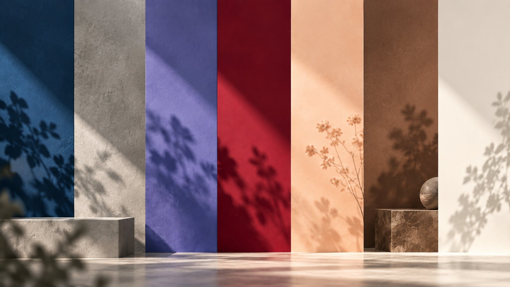
Every December, Pantone's Color Institute names a single shade meant to capture the year ahead - a genuine industry benchmark that ripples through fashion, product design, and interiors well beyond the color world itself. Here's every Color of the Year from 2020 through 2026, and what each one was actually getting at.
2020 - Classic Blue (19-4052)
A steady, dependable navy blue, chosen as a symbol of confidence and calm heading into a genuinely uncertain year. It became one of the most quoted Colors of the Year in Pantone's history, for reasons that had nothing to do with color trends.
Only the second time in over two decades that Pantone named two colors at once - a solid, dependable gray paired with a bright, optimistic yellow. The pairing was meant to represent strength and positivity working together, reflecting a year defined by recovery.
2022 - Very Peri (17-3938)
A periwinkle blue-violet, and the first Color of the Year Pantone created from scratch rather than selected from an existing palette - built specifically to represent the blend of digital and physical life that had become the norm.
2023 - Viva Magenta (18-1750)
A bold, unconventional carmine red developed with the help of an AI tool and inspired by cochineal, a natural dye historically drawn from insects. Pantone described it as a color for "an unconventional time."
2024 - Peach Fuzz (13-1023)
A soft, warm peach tone chosen for its sense of comfort and gentle optimism - a deliberately calming pick after several years of bold, high-energy colors.
2025 - Mocha Mousse (17-1230)
A rich, warm brown evoking chocolate and coffee - grounding, comforting, and versatile enough to work as a neutral base across interiors, fashion, and branding alike.
2026 - Cloud Dancer (11-4201)
The first white shade ever named Pantone's Color of the Year. Described as "a billowy, balanced white imbued with a feeling of serenity," it's meant as a deliberate pause - a calming counterweight to an increasingly noisy, technology-driven world.
Color Choice Is Part of the Bigger Picture
Whatever palette you land on, color works best when it's decided alongside the rest of the interior design - materials, lighting, and furniture all shift how a color actually reads in a real room.
The ancient Egyptians, in turn, knew that lapis lazuli has a blue color. Since this gemstone had a very high price, it was eventually replaced by an artificial one - copper and calcium silicate.
In the Middle Ages, wearing clothes with blue shades symbolized wealth and dignity. Louis Saint (king of France) used the blue color on the coat of arms, combining it with lilies.
The clothes of the Mother of God were also precious blue. It was lapis lazuli, powdered. He was brought from across the seas. It was then sold at the price of gold. Such a blue powder was so expensive that initially the customer ordered the price of pigment with the artist, and only then it was a question of rewarding the author of the painting. Since the blue color was often used in painting, they began to identify it with calm, humility and holiness. “Madonna and Harpy” is a famous painting in which the clothes for the Holy Virgin were “made” from expensive ultramarine.
Often, artists used less expensive blue pigments in their work than lapis lazuli or indigo pigments. This is due to the fact that creative people could have problems with these pigments - blue shades, after some time, turned green. The azure shade on the canvas turned dark green. Thus, the artist did not get the right color.
In painting, the blue color was expensive and noble. During the Renaissance, clothes in blue colors became very popular. Those who sold wajda (dye plant) earned excellent money for those times. Blue clothing was preferred by workers and artisans. In those days, a blue tint was excluded from the decoration of the church altar, since it was very common.
It was very stereotyped that the dye industry was no substitute for anything. However, in the 15th century, indigo color penetrated from India to Europe. The plant was delivered by sea to Marseille, London and other cities. In those countries where dyeing was developed, they tried their best to ban indigo. It was illegal and there was even a death penalty. Indigo was called the "diabolical potion." Since the quality of indigo was very high, all prohibitions became in vain.
The invention in the 18-19 centuries of synthetic dyes again provoked the use of blue shades. Experiments were carried out using cobalt pigment. So, William Turner used it to create paintings. Remarkably, Renoir loved this shade. He preferred bright, colorful, pure colors.
1802 was marked by the fact that Louis Jacques Tenard (a chemist from France) presented the world with the best version of cobalt pigment. He was also more expensive. Then the famous Van Gogh wrote to his brother that he considered cobalt to be a divine color, more beautiful than which the other simply does not exist.
After the end of World War II, all the important world organizations used the blue color - the UN, NATO, UNESCO and others. UN peacekeepers wear blue helmets to emphasize their crucial role.
When the era of the Internet began to flourish, in browsers hyperlinks began to appear in blue. Of course, the logo of the widespread social network Facebook is blue.
For 20 years, Pantone has been choosing the color of a particular year. The Institute of Color gives predictions for each year, which significantly affect many areas of the industry, in particular, design and fashion.