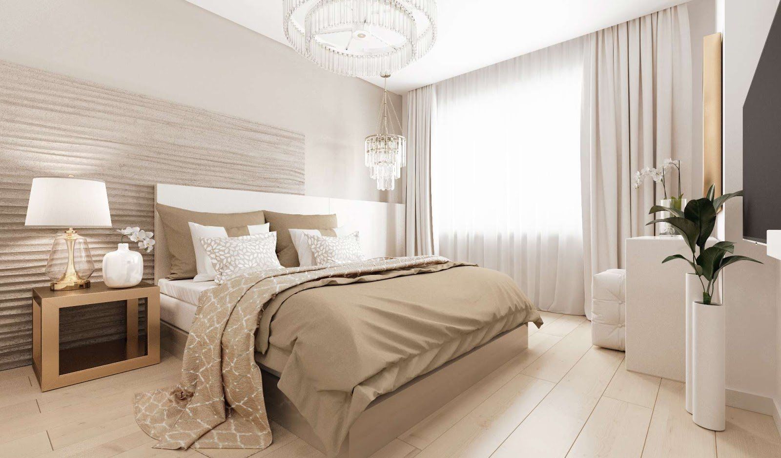
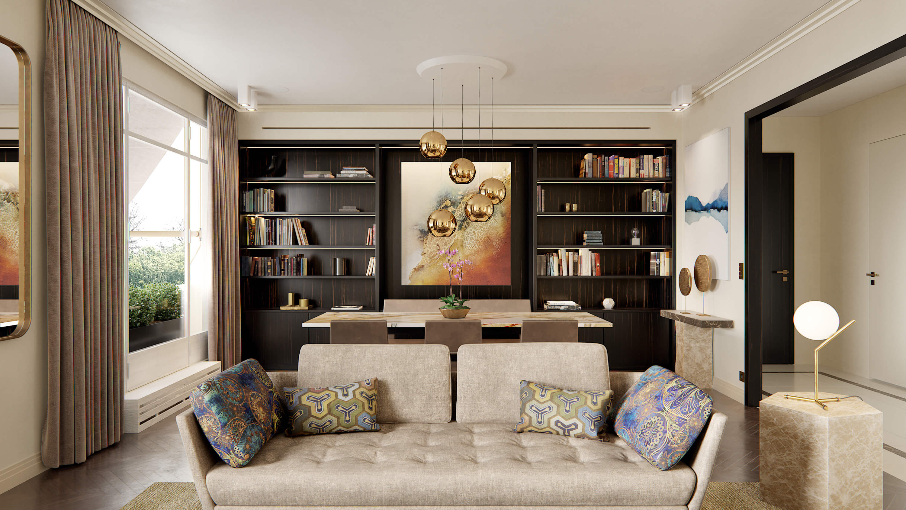
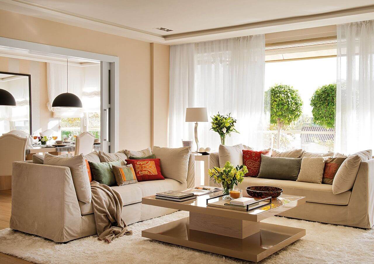
One of the most popular colors in interior design is beige, cream. It would seem that it can be difficult when working with such a color, but, as it turns out, beige is one of the most difficult shades for a designer. Why does everyone like this color so much? The answer will be quite simple, but it will answer this question as accurately as possible. The thing is that such a color scheme is light, does not overload a person inside with complex combinations and images, the shapes of furniture items, decor are easily separated, separated by a glance, contrast and depth of perception of interior design elements appear, while designers very often complain about that the interior in this color is often very boring and monotonous. As for the beige color, it is a very "neat" and perceptually stable color. This color is softly perceived, it does not have "sharp corners", there is some neutral perception and a sense of restrained completeness, elegance, conservatism, it is not for nothing that beige is called the third most important color in the interior after white and black.
BACK
Beige color in interior design

In interior design, the scheme of form, material and color always works. The neutrality of the beige color subdues the logic of form, which means that if we apply a complex form, we will lose it in brevity, minimalism, airiness, and in design, as you know, it is very important to maintain balance, not to overdo it with the pretentiousness of the form. As we learned earlier, each interior style has its own visual language of color. The color beige is found in modern, classic and art deco directions.
It is always very important to consider light when decorating an interior with beige. It is very important to understand that this color does not forgive mistakes in the quality of the materials used, this color is very fond of soft scattering of light on natural materials, such as metals, stone, tinted glass. It is very important to deal with the zoning of the space and highlight separate groups, such as furniture (form). It is always necessary to remember about the integrity of the interior, which means that if you use plain floor and wall coverings when choosing, a little accents will not hurt, but in no case overdo it! This is one of the most important tenets when working with beige. No vulgarity! Beige is the color of elegance, he loves muted shades, half tones. The top of the professionalism of a designer is to work with a balance of accents, without lack and excess.
Well, at the end of the article we will tell you a secret - there is a golden rule for using beige - 65/25/10. If 65 percent is beige (floor / walls), 25 remains under high-quality (emphasize) materials of furniture, upholstered furniture, and the remaining 10 percent is metallic materials that will give the interior a little Art Deco style, but will not make it vulgar, but will it is luxurious and expensive and will emphasize the taste of the Owner and Designer who has developed for you the interior in beige colors and tones.